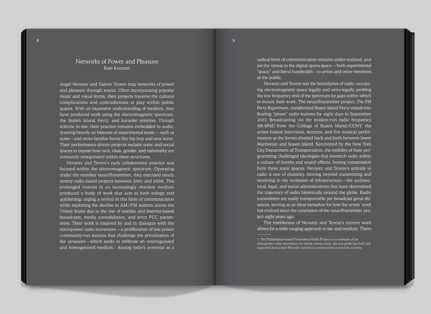
Pages 8–9.
In 2016 we were commissioned to design a catalogue for the Angel Nevarez and Valerie Tevere show at ICA Philadelphia. Their work uses video and sound, and is so diverse that our challenge was to identify and distill a few common themes into book form.
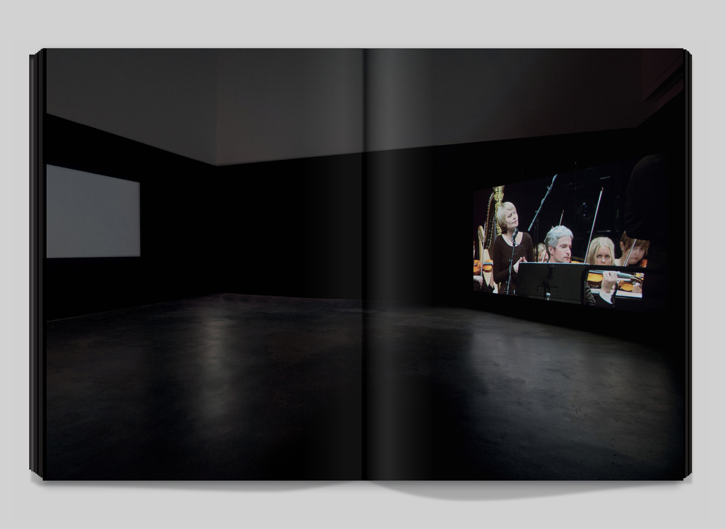
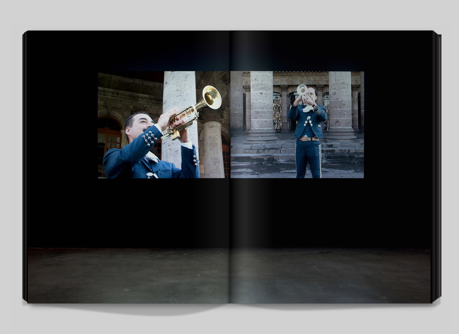
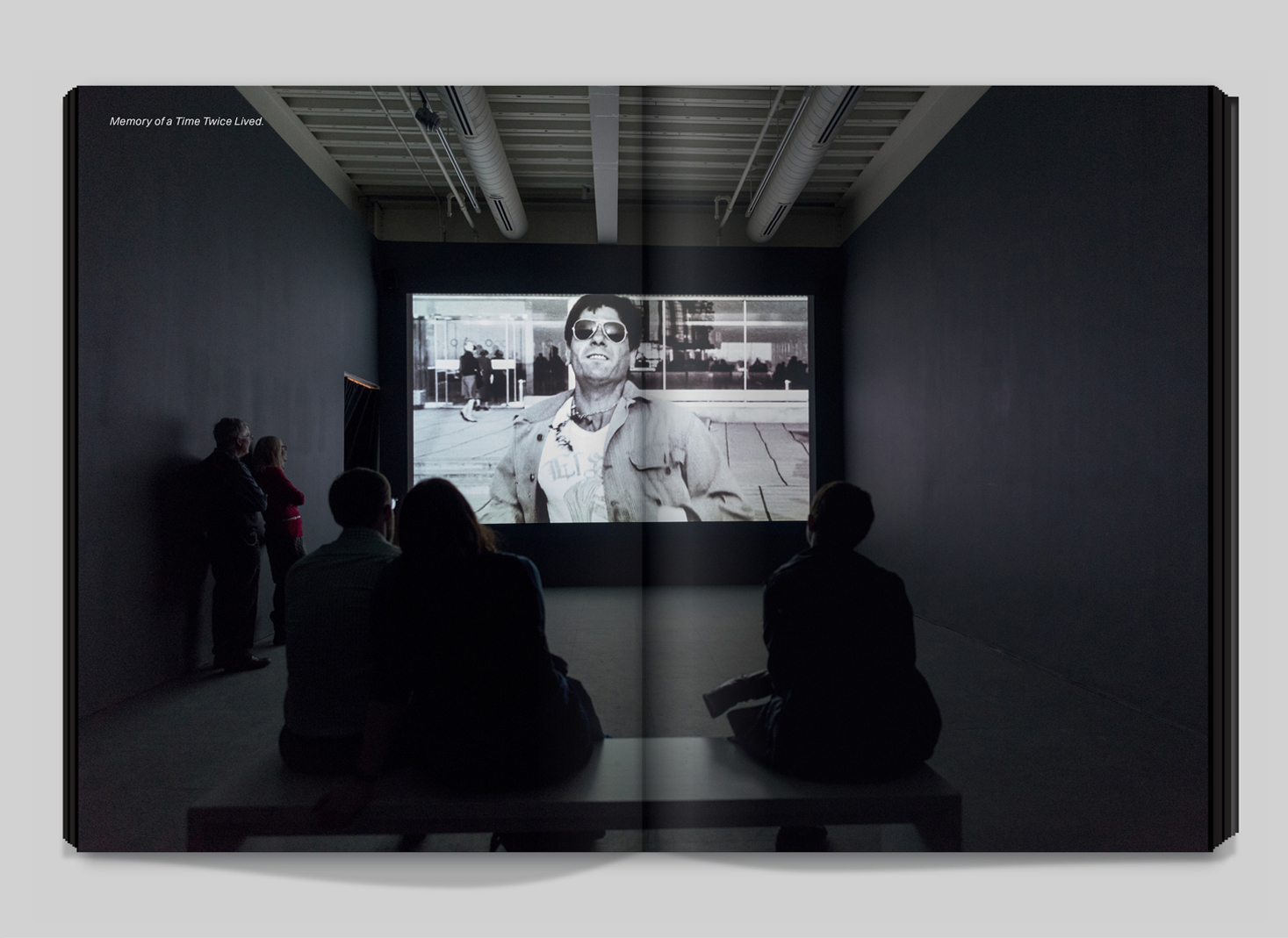
The curator’s presentation of their work at ICA gave us the catalyst for our idea; it was shown in a series of adjoining darkened rooms, where the art emerged like transmissions from random broadcasts beamed through the ether. Mariachi bands, orchestras, stills from La Jettee and Morse code from sailboats were received and recombined in a jumble of cultural signals.
Pages 8–9.
Pages 68–69.
Pages 90–91.
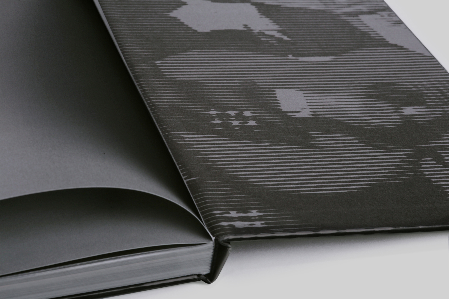
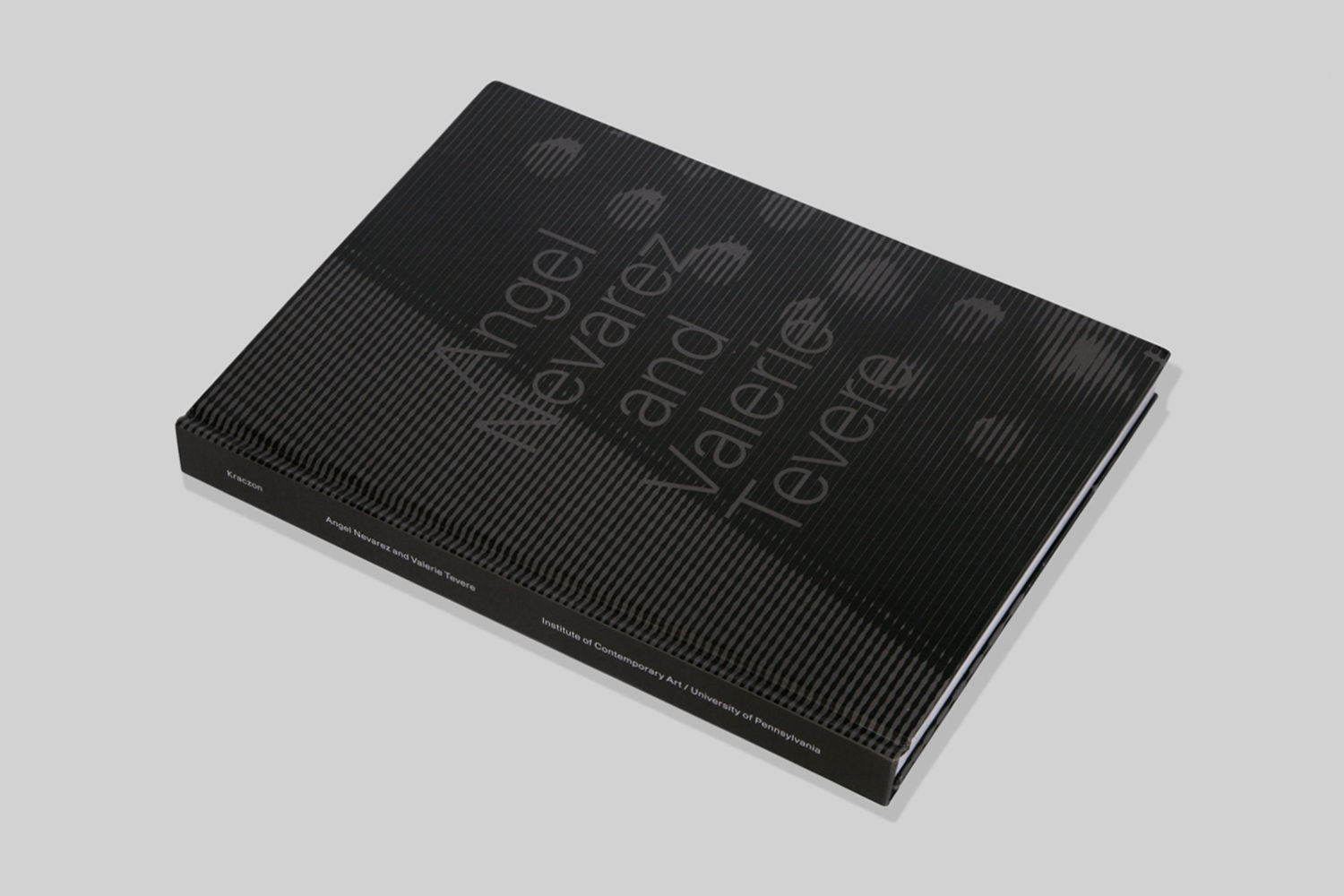
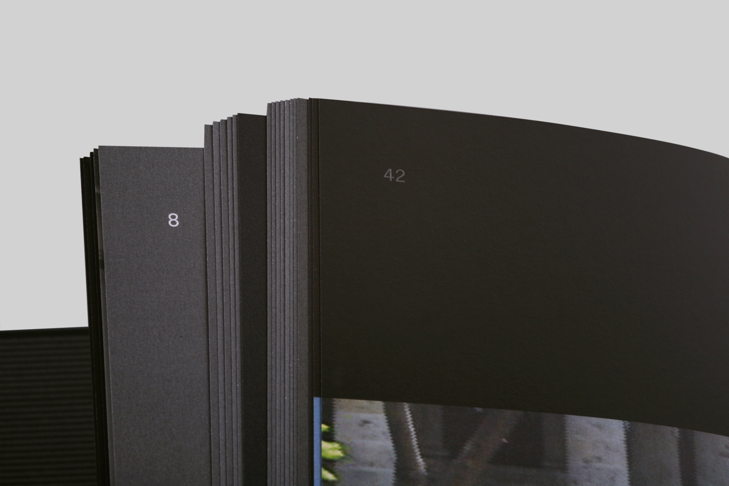
Returning from the show we considered making a book which, like their art, was predominantly dark in context. We wanted the white space to be black and the black type to be white; like a microfiche film found in a library. Still, the idea of a black book gave us some trepidation, knowing the inherent production problems. White type at a small scale can create a blemish of fuzzy color around its edges when knocked out of a field of rich (CMYK) black. This imperfection can be avoided by using registration black (K), but then the depth of blackness is sacrificed.
We decided to make this printing dilemma a visual motif. Long form texts were knocked out of registration black, while words we wanted to de-emphasize, such as marginalia, were printed as registration black knocked out of a rich black ground. Clips from films, event documentation, and artifacts were printed in both of these black tones.
Pages 104–105.
Pages 82–83.
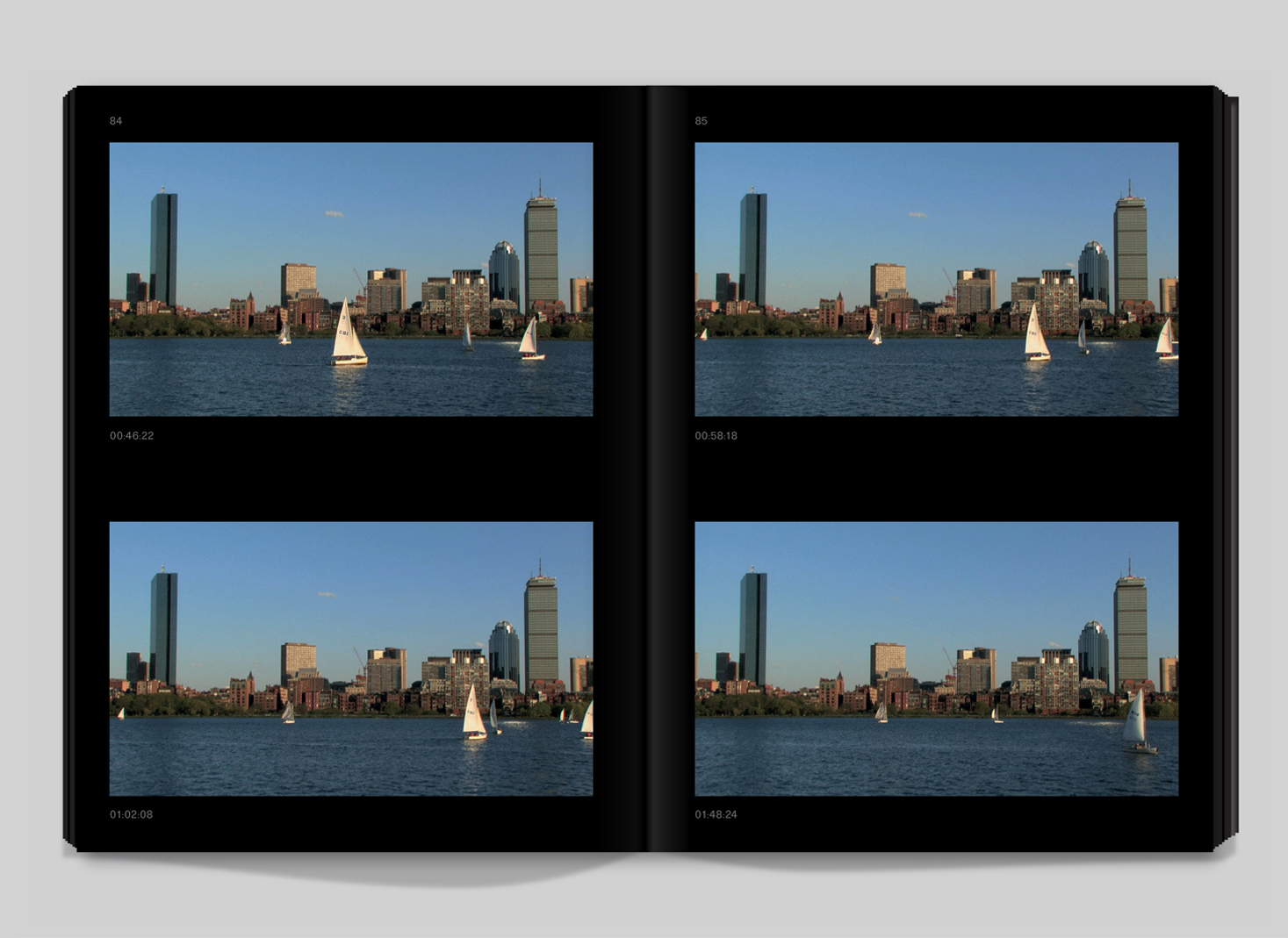
Pages 84–85.
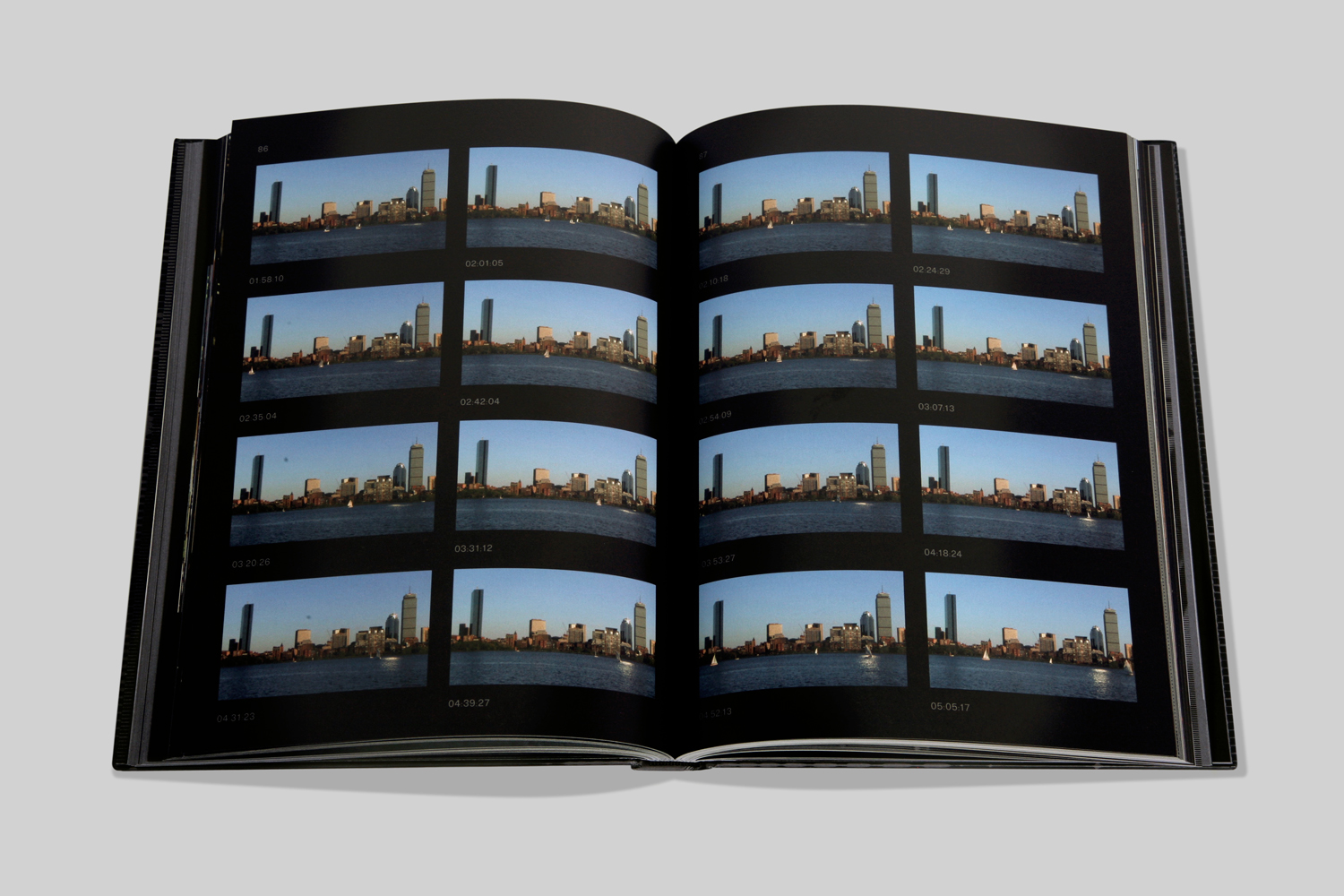
Pages 86–87.
Pages 162–163.
Pages 38–39.
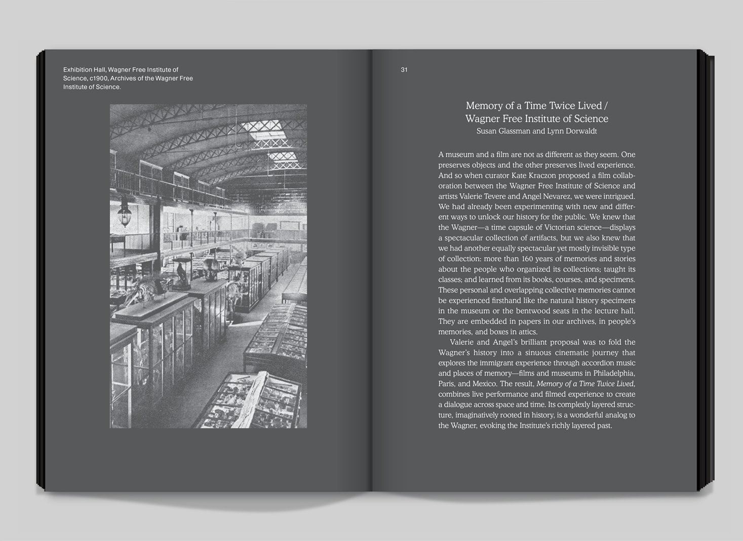
Pages 30–31.
Pages 154–155.
After getting the book proofs back, we decided to cut the black down to an 80% tone. Using a pure 100% turned out to be a better idea in our heads than in reality. We just needed a little more contrast to make the concept work. Looking at it now, the design reminds us of a dark grey magazine 8vo put out in 1987 about a Wolfgang Weingart lecture. In that issue, the background was meant to evoke the darkened room of a slide presentation.
Pages 98–99.
Pages 20–21.
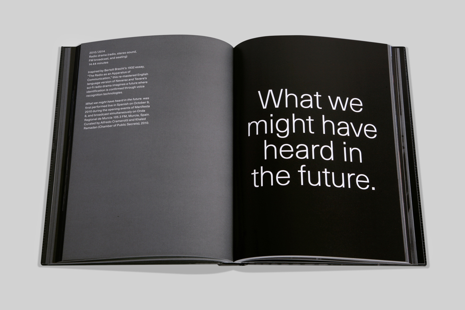
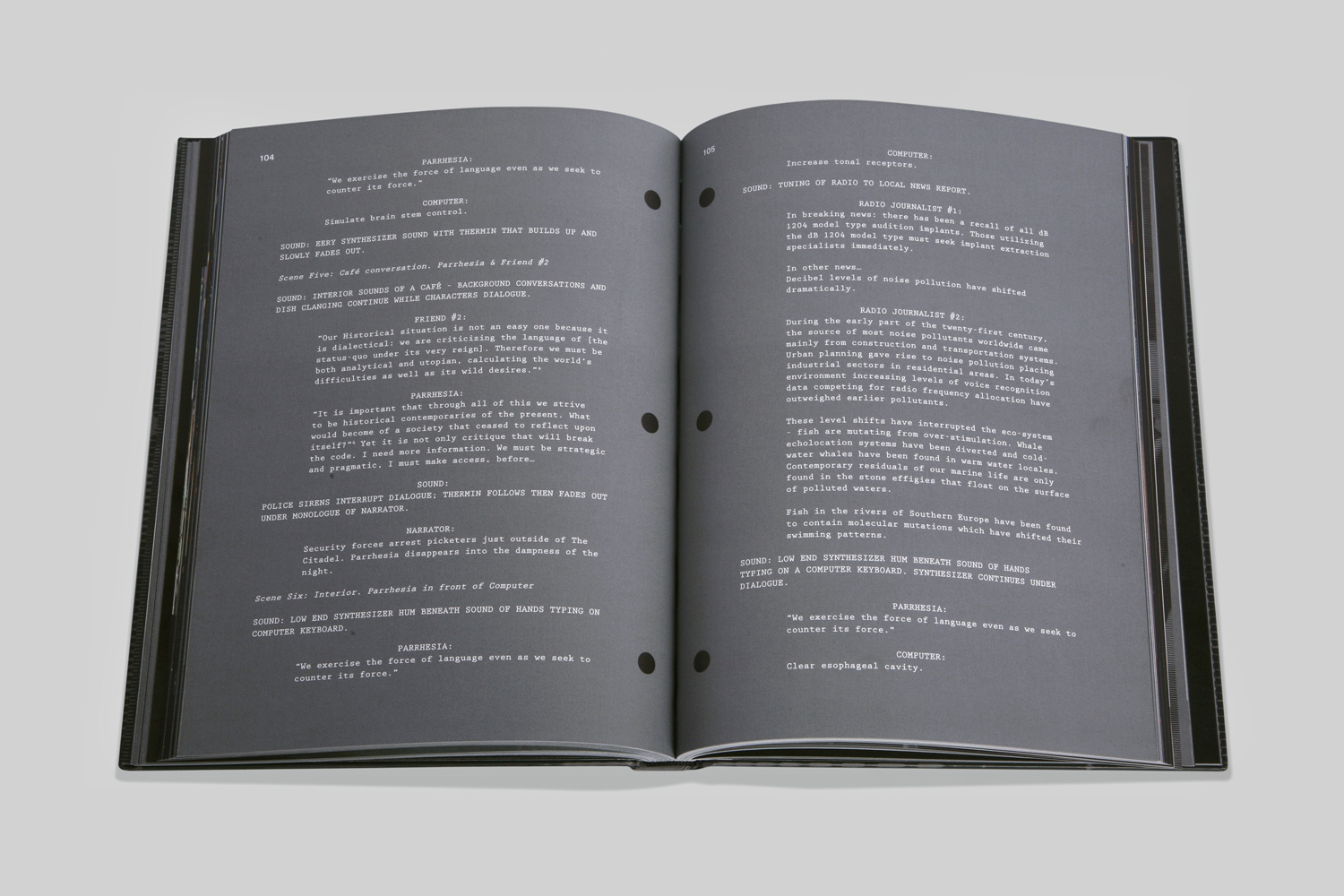
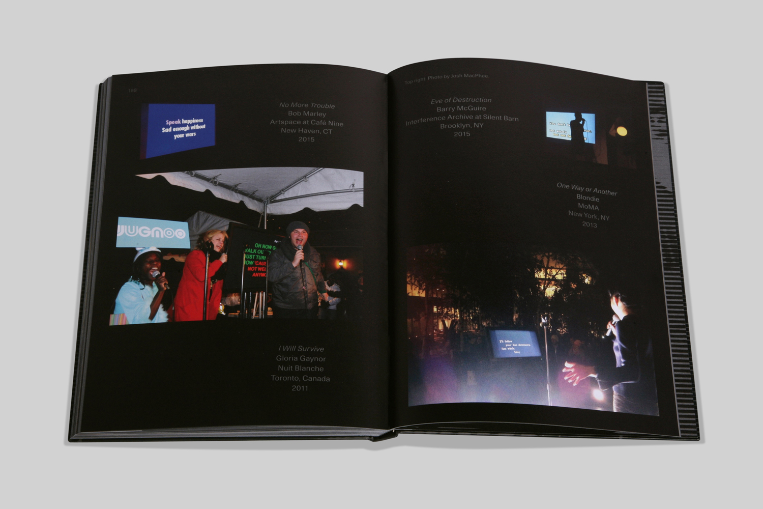
Every section featured a different layout responding to a project; there were transcripts presented in screenplay format, regular bookish pages, double page spreads mimicking split screen videos, and a variety of other strategies.
Pages 168–169.