Valerie Spulock’s, In Lieu of Solutions, 2023.
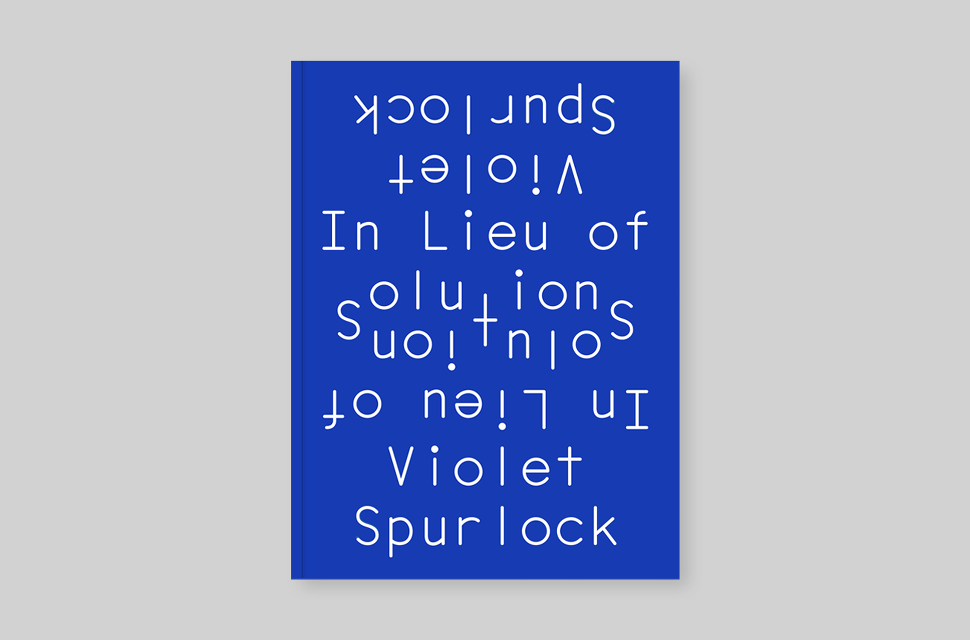
Valerie Spulock’s, In Lieu of Solutions, 2023.
In 2012 we started designing book covers for Futurepoem. The organization has a rotating panel of editors who find emerging and underrepresented poets. With each cover we try to encapsulate the diversity of this writing, interpreting the specific voice of the author rather than relating the design to the rest of Futurepoem line-up. Heterogeneity is central to the mission of the press, so we try to reflect that in the designs we produce for them. The only fixed element is the cover size of 6 × 8 inches.
Lindsay Choi’s Transvere, 2021.
Instead of writing a conventional brief 최 Lindsay | Lindsay Choi shared a series of pictures for inspiration. These installation shots documented works by Kazuko Miyamoto in which hundreds of taut strands of thread are pinned between gallery walls to create web-like forms. The Transverse cover is an attempt to echo this spatial idea in the medium of print, using linear repetition to dematerialize surface and blurring the distinction between figure and ground.
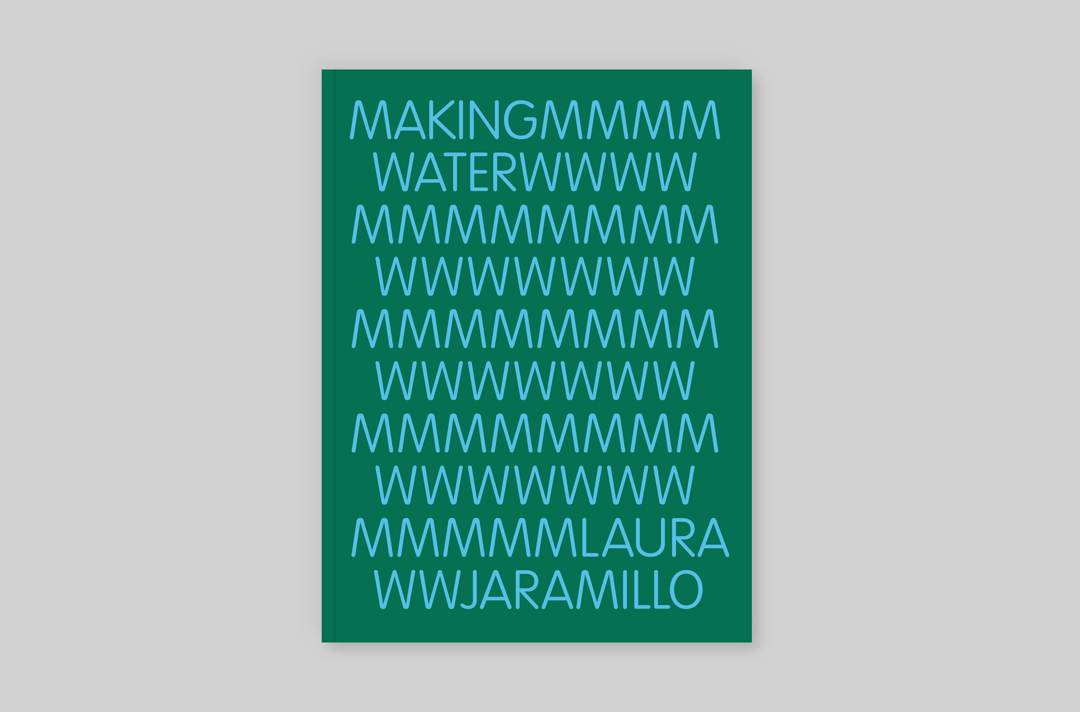
Laura Jaramillo’s Making Water, 2022.
The Making Water brief called for words that are somehow liquified, or transformed into image. Our idea repurposed the letterforms ‘M’ and ‘W’ of the title initials as wiggly symbols for waves, allowing the cover design to be typed out as a sea of letters.
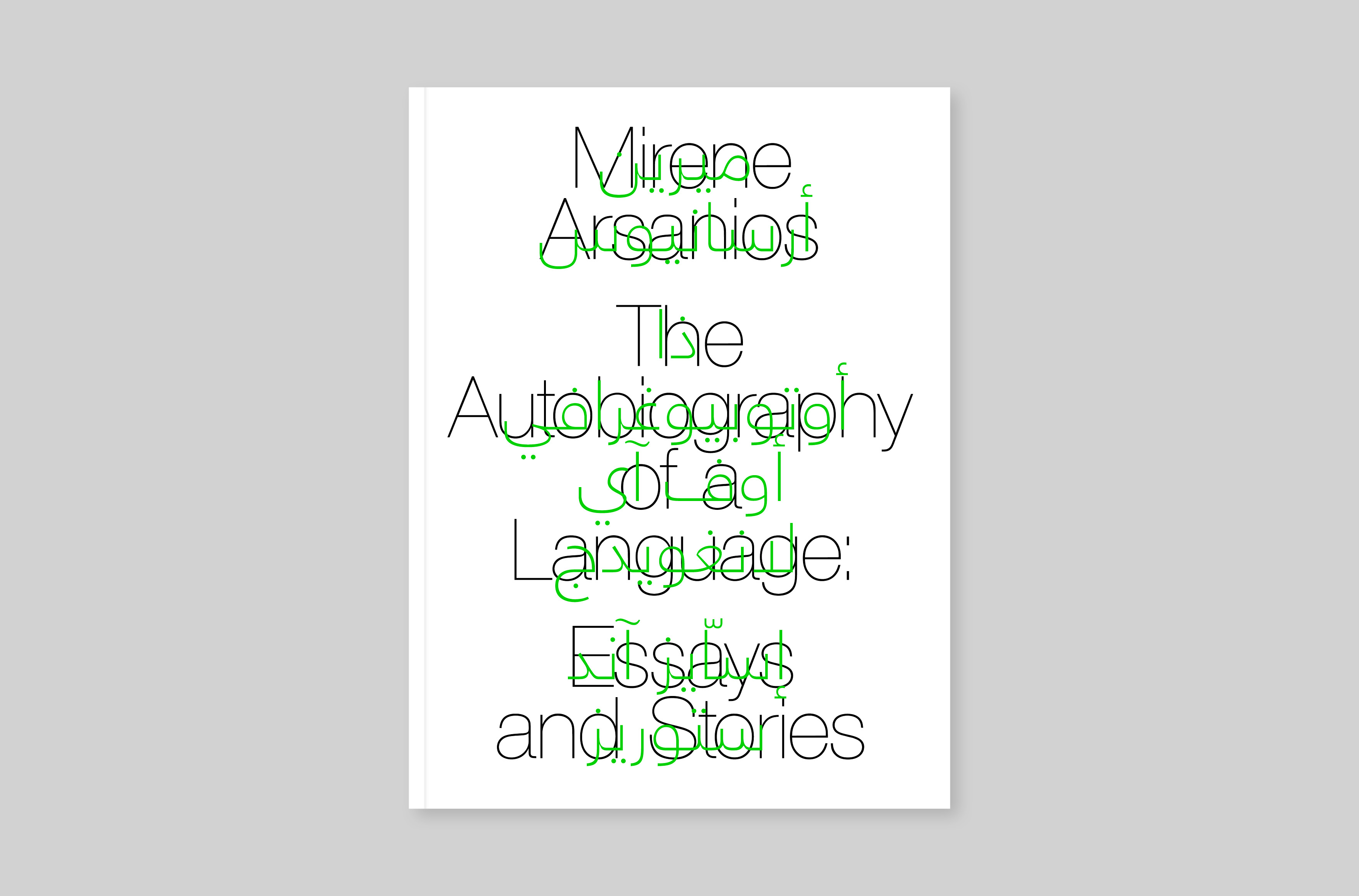
Mirene Arsanios’s The Autobiography of a Language: Essays and Stories, 2022.
Mirene Arsanios asked for a design which would both articulate the idea of language defamiliarization and evoke her personal history. We superimposed Arabic text over the book's name and title, matching the weight of the underlying Roman letterforms. This top layer of the translation, however, is only phonetic; Arabic readers initially read the words as a kind of interference or nonsense.
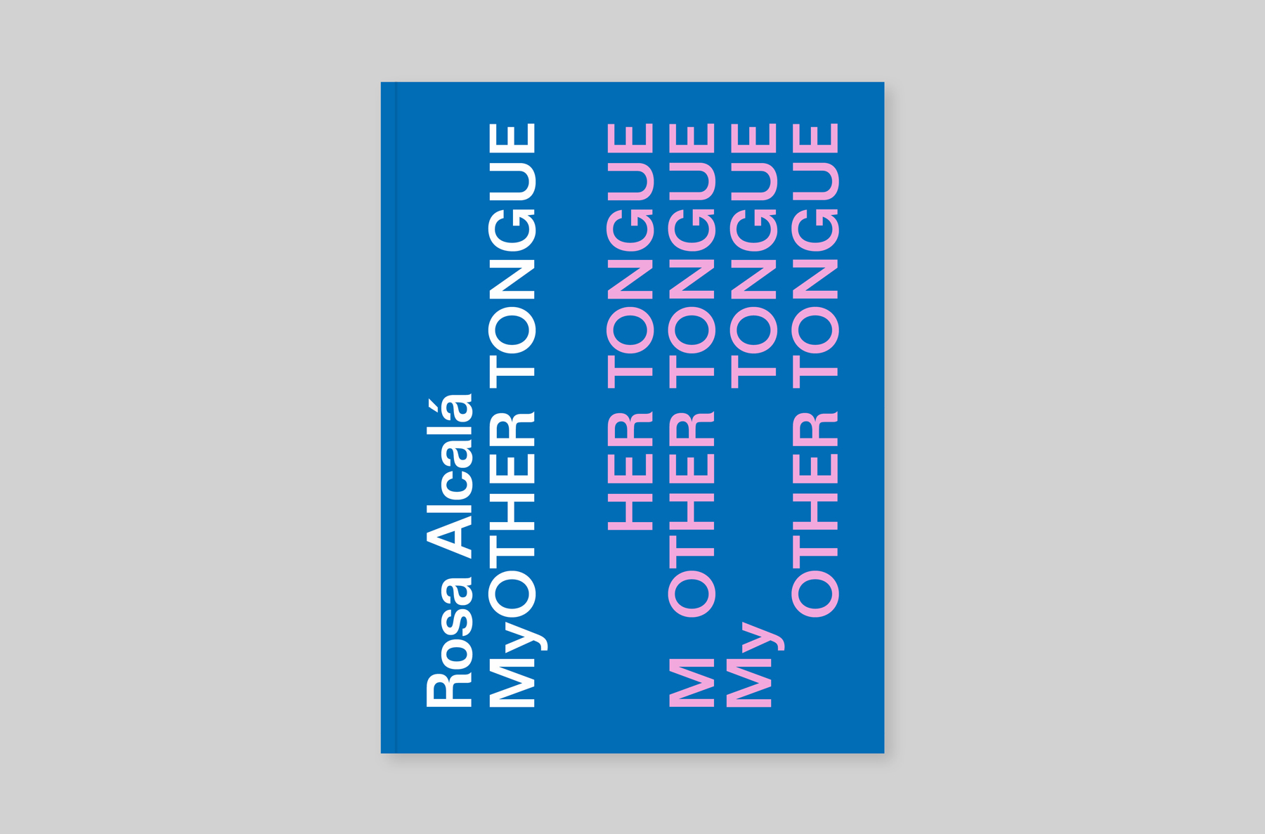
Rosa Alcalá's My Other Tongue, 2017.

Manuel Paul López's, Nerve Curriculum, 2023.
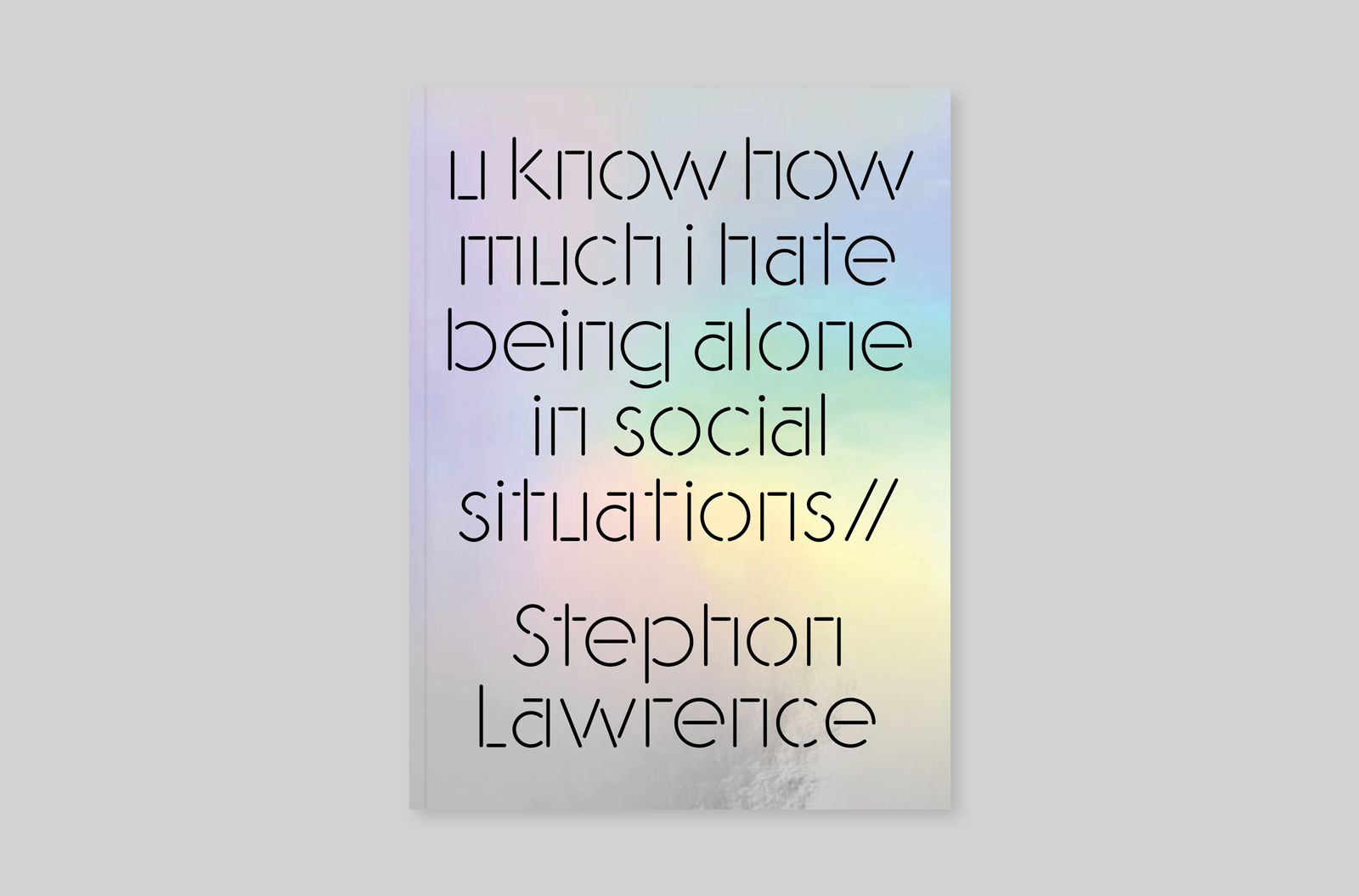
Stephon Lawrence's how much i hate being alone in social situations //, 2022.
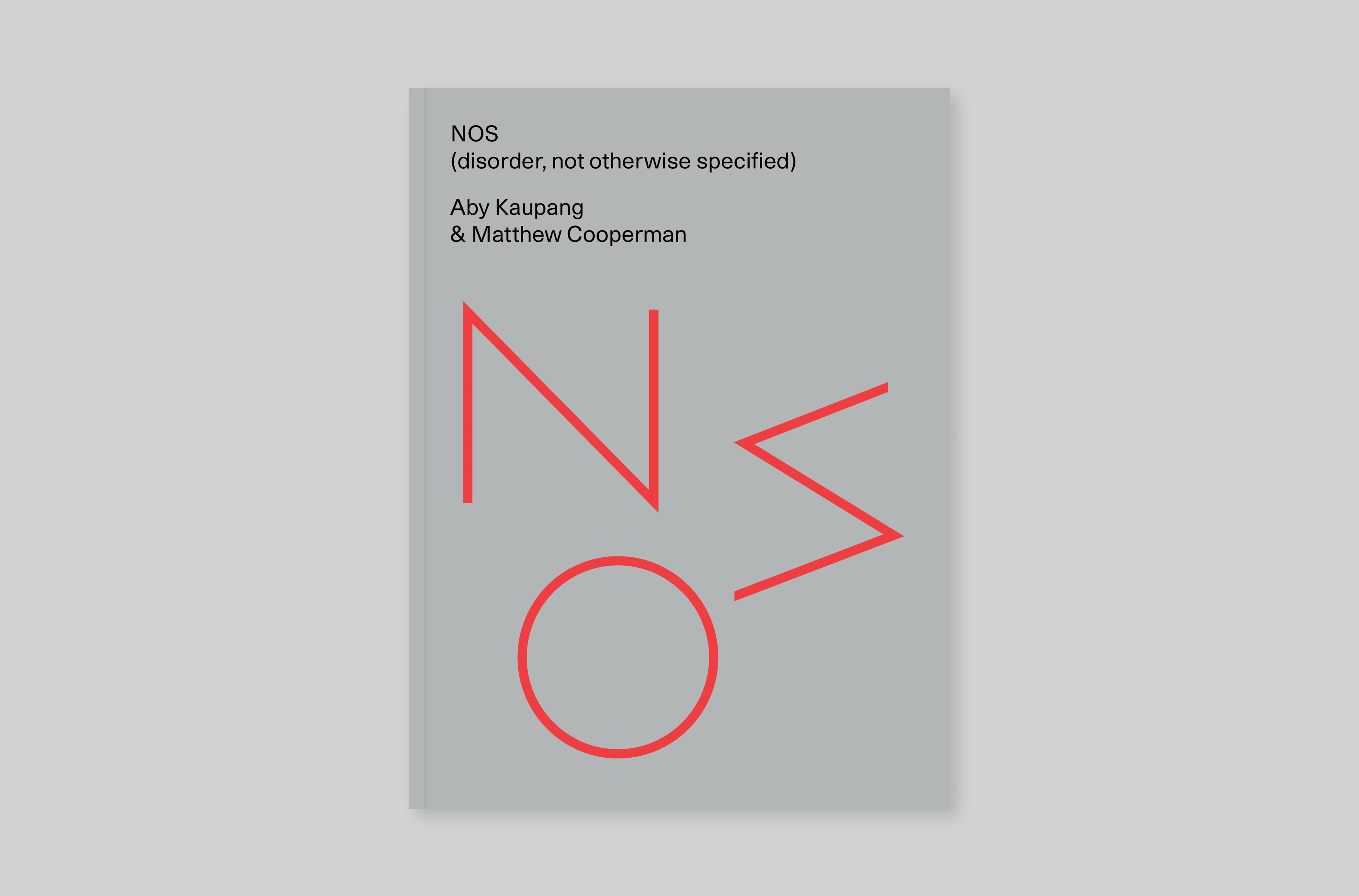
Aby Kaupang and Matthew Cooperman's, NOS (disorder, not otherwise specified), 2018.
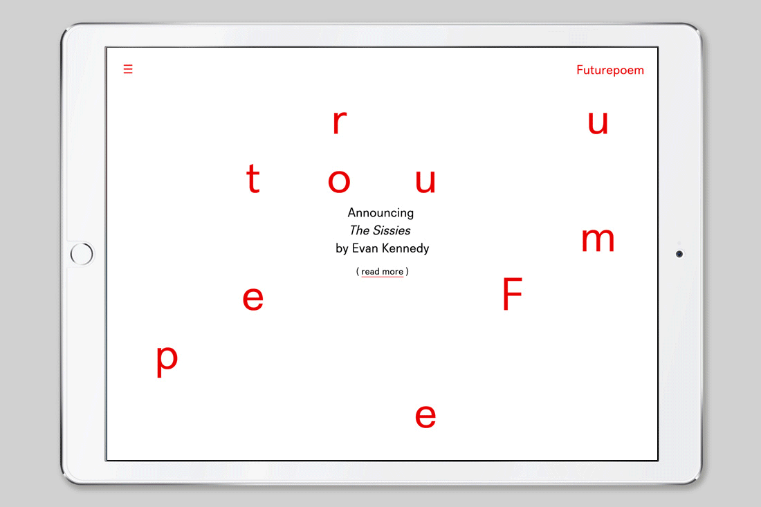
In 2015 we were given the task of rebranding Futurepoem. The editorial board told us to avoid a ‘logo solution’. There was a consensus among the staff that a fixed mark would be antithetical to the open nature of the organization. Our proposal was a mutable logotype in which the letters appeared in unpredictable arrangements: On a button, the word Futurepoem flexes into the shape of a circle, a tote bag reshapes it into a square, while the homepage of the site becomes a surface of randomly dancing configurations. In each application the word Futurepoem responds to the thing it appears on; we created an identity which tries to speak to the instability of language and meaning.
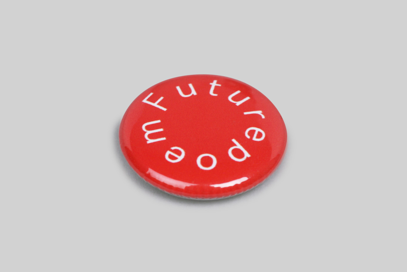
Badge.
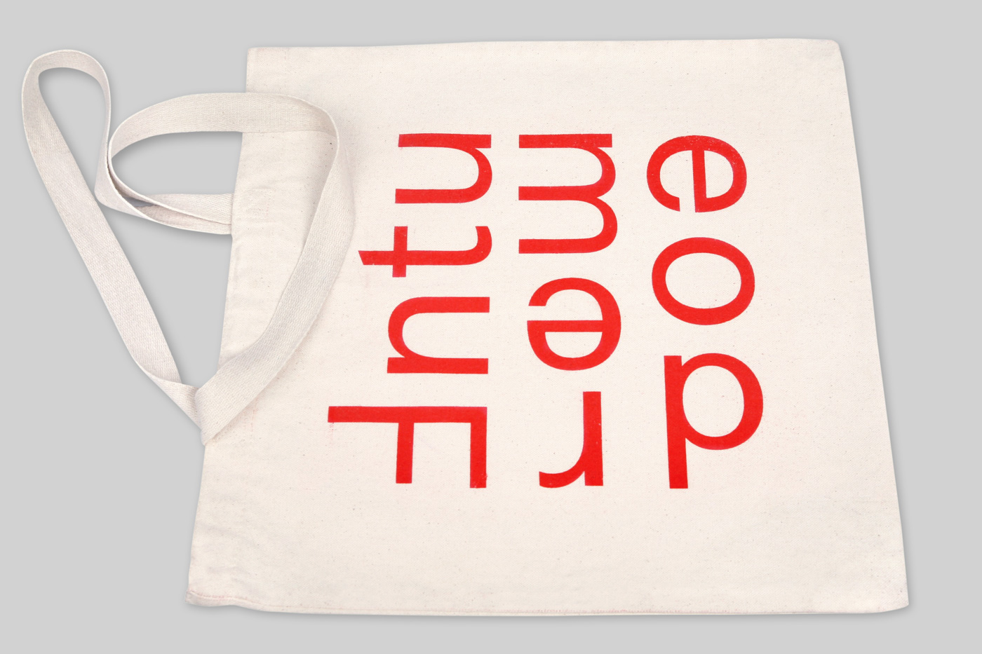
Tote bag.
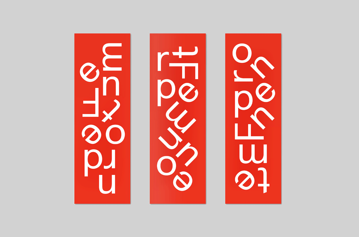
Bookmarks.