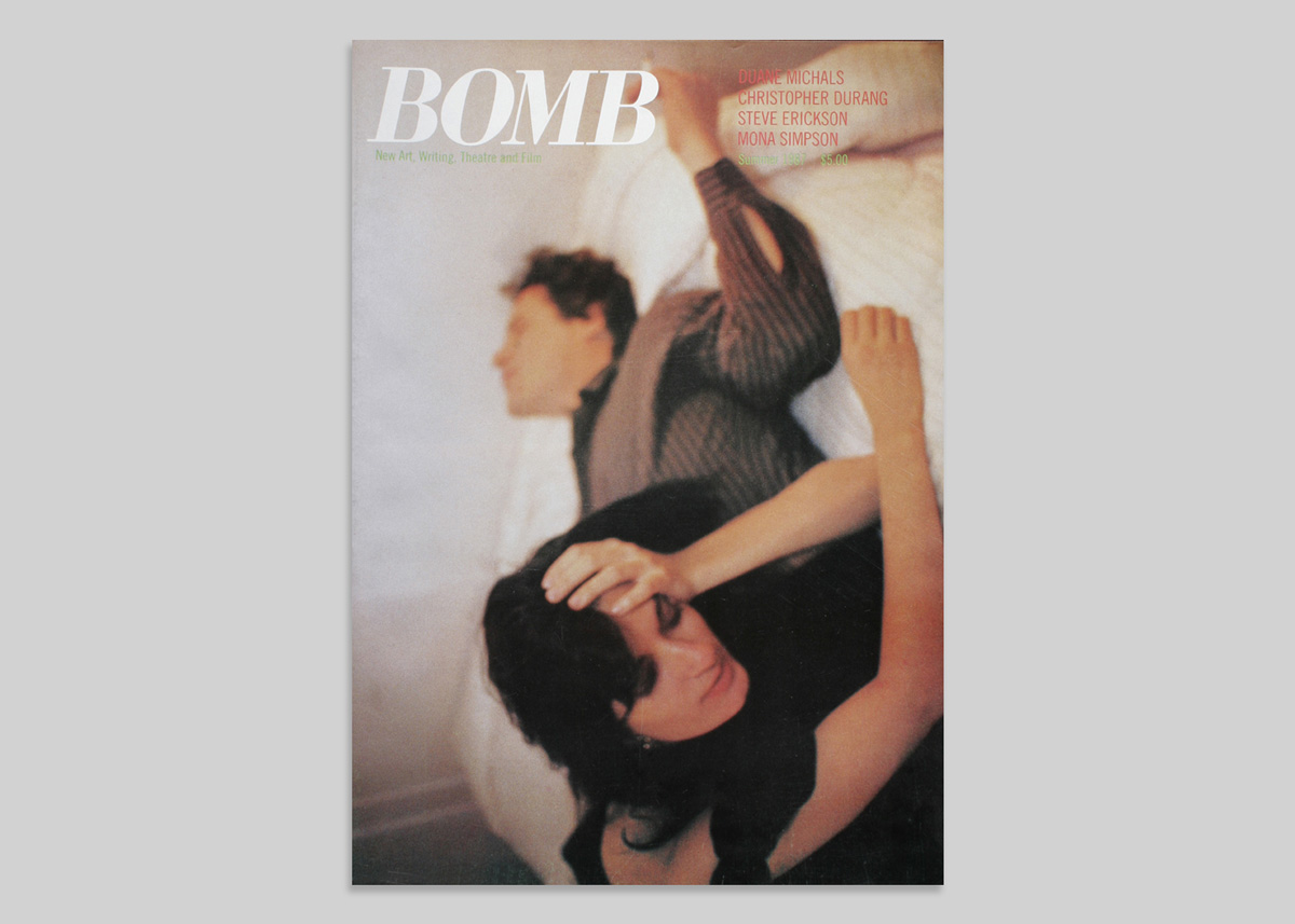
BOMB 1, 1981.
BOMB, a New York City based interdisciplinary arts magazine, was founded in 1981 by Betsy Sussler. It is unusual among art publications as the interviews are conducted by artists instead of staff writers; the aim is to strip away editorial veneer, showing how creative people talk among themselves.
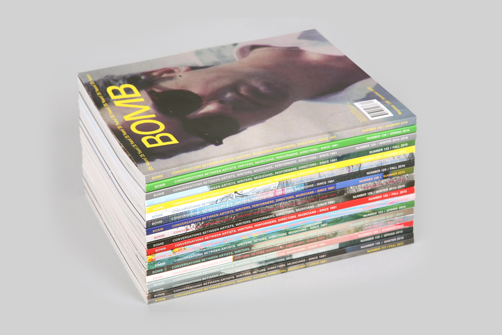
Before we started designing BOMB magazine, we went to the office to research its history. The archive we found was like a fossil record of graphic design evolution; spanning three decades, BOMB’s mutation of style was redefined by successive strata of designers. Magazines, perhaps more than most forms of design, indicate a precise history of graphic innovation because publishing cycles catch the micro-trends of the moment.

BOMB 1, 1981.
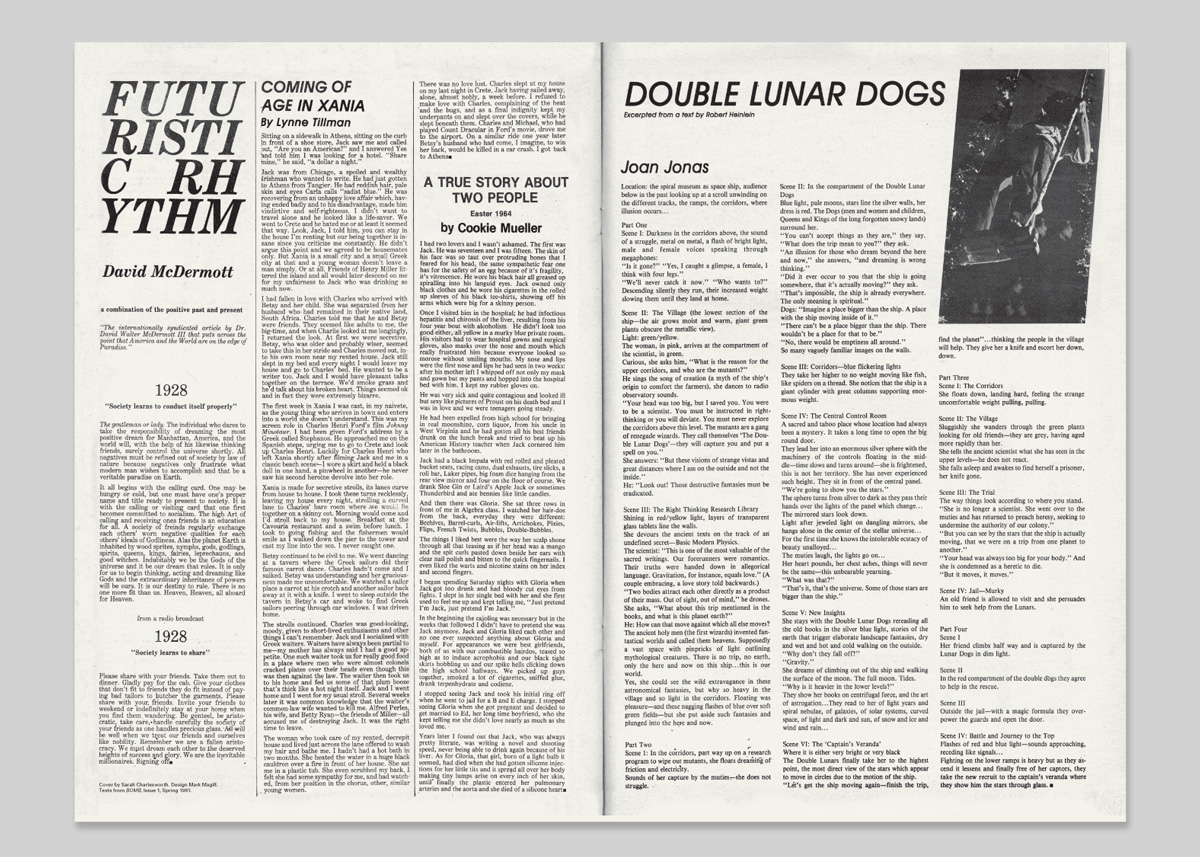
Pages from BOMB 1.
BOMB 20, 1987.
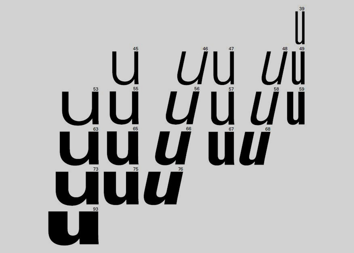
Univers designed by Adrian Frutiger, 1954.
Rather than try to find the ideal form for BOMB’s content, our approach attempted to capture what we had experienced on the shelves of their archive — the sense of ephemerality and scrappiness. To begin with we designed every issue with a different layout. The building blocks of the magazine — the caption, the column, the headline, the footer — we imagined would change in scale and placement for every issue. The only constant we gave ourselves was the use of the typeface Univers, simply because it has so much stylistic variety. As the years passed we settled into layouts with longer timespans. We stopped frantically remaking the grid from scratch for each issue, and would allow the same template to be repurposed for a year at a time.
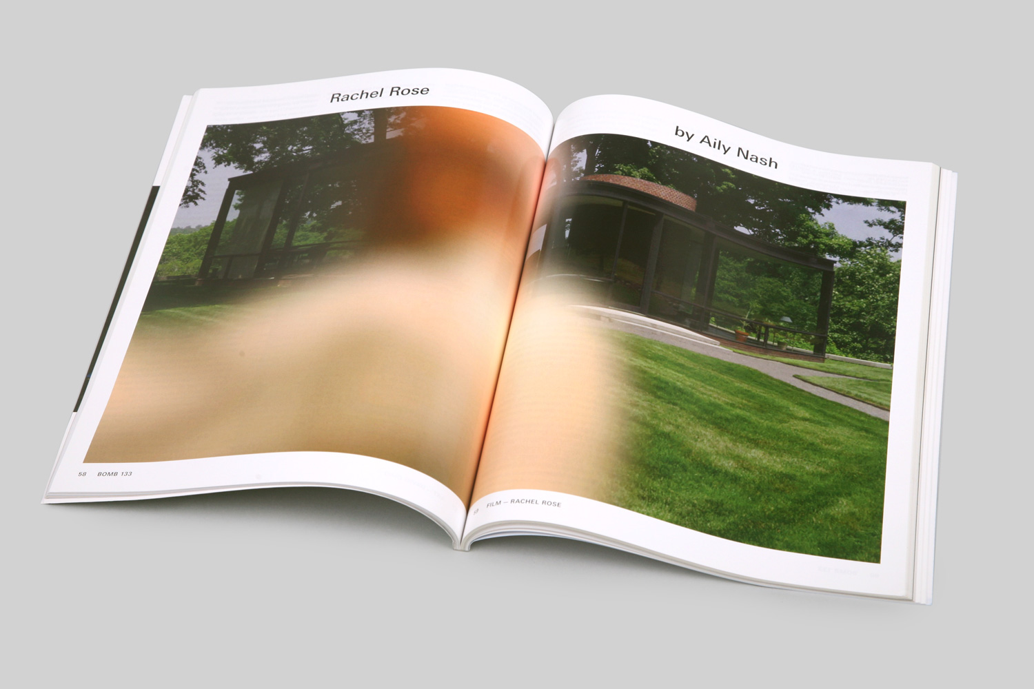
BOMB 123, pages 58–59.
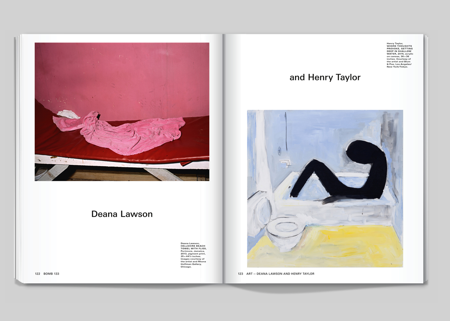
BOMB 133, pages 122–123.
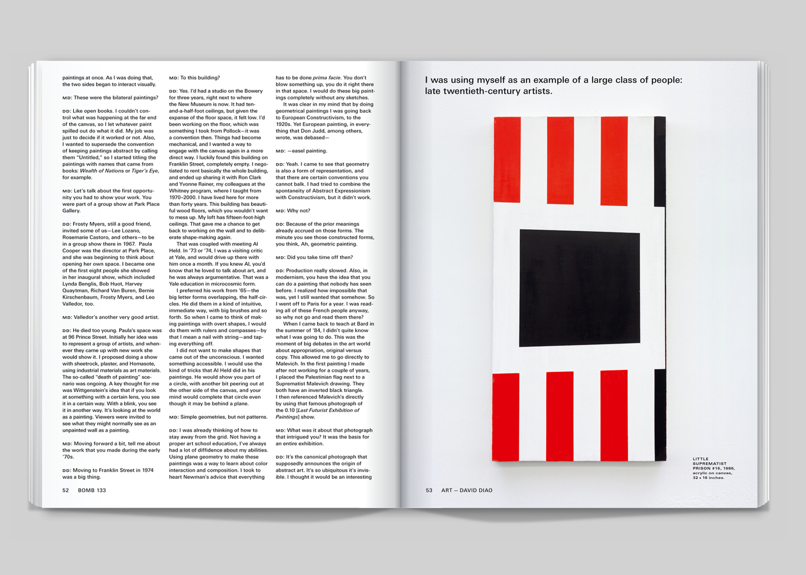
BOMB 133, pages 52–53.
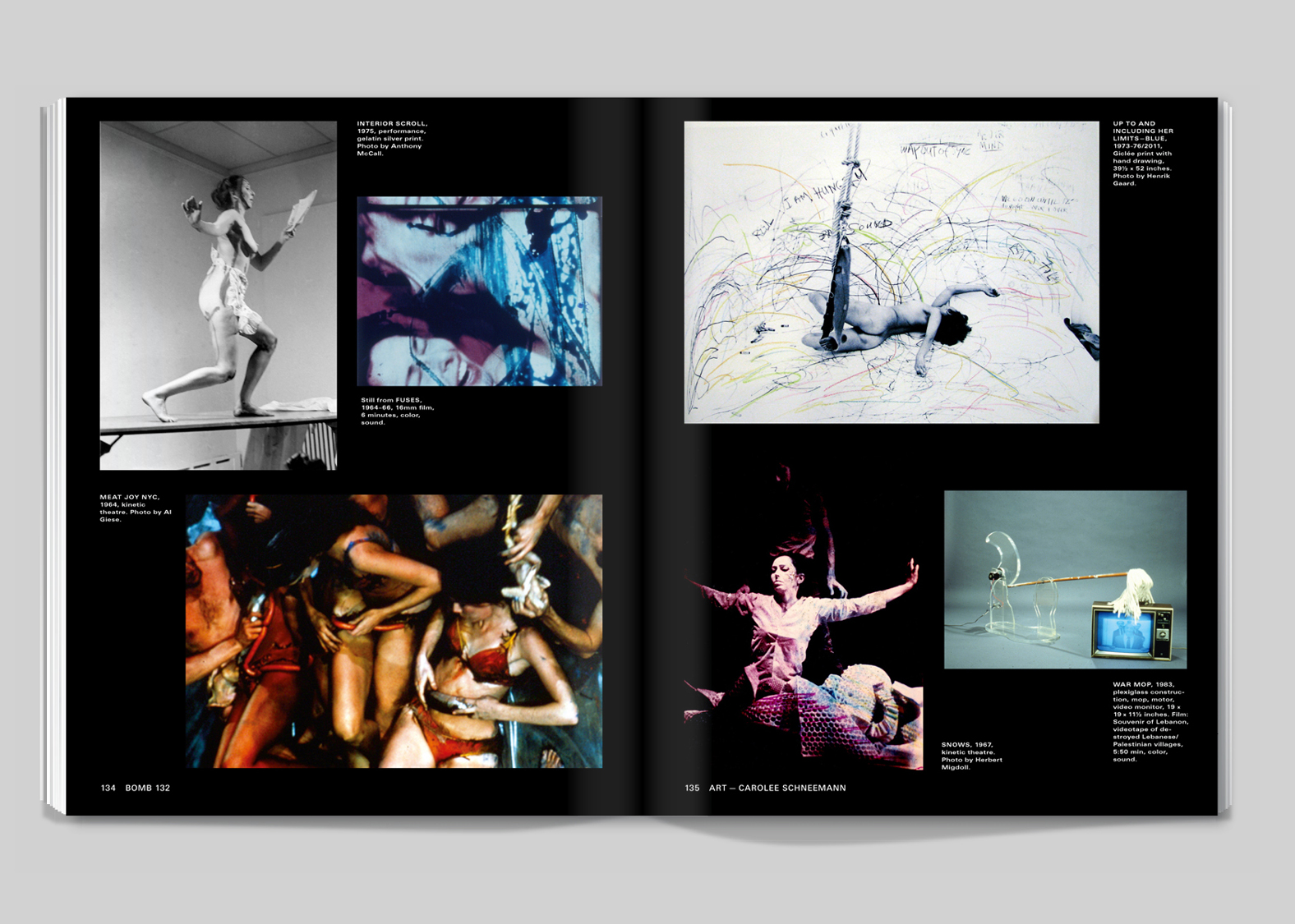
BOMB 132, pages 134–135.

BOMB 132, pages 120–121.
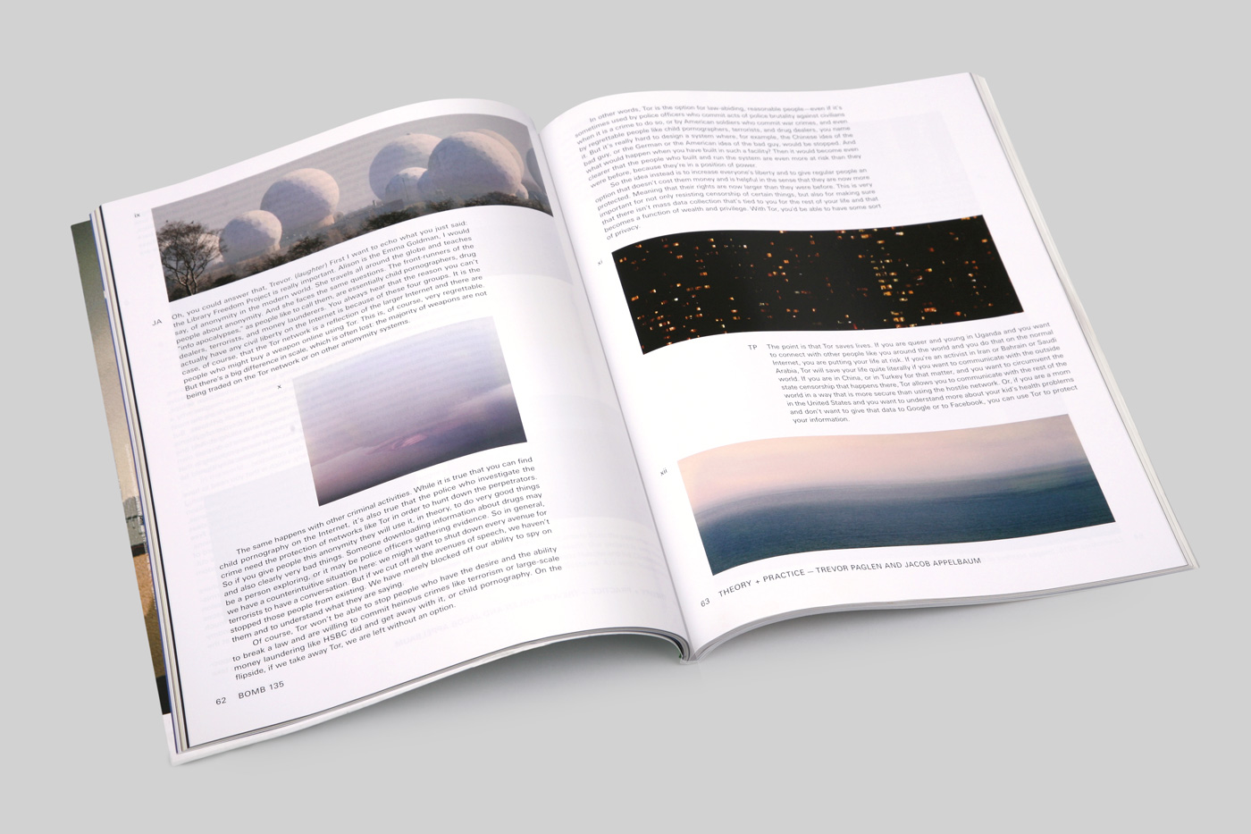
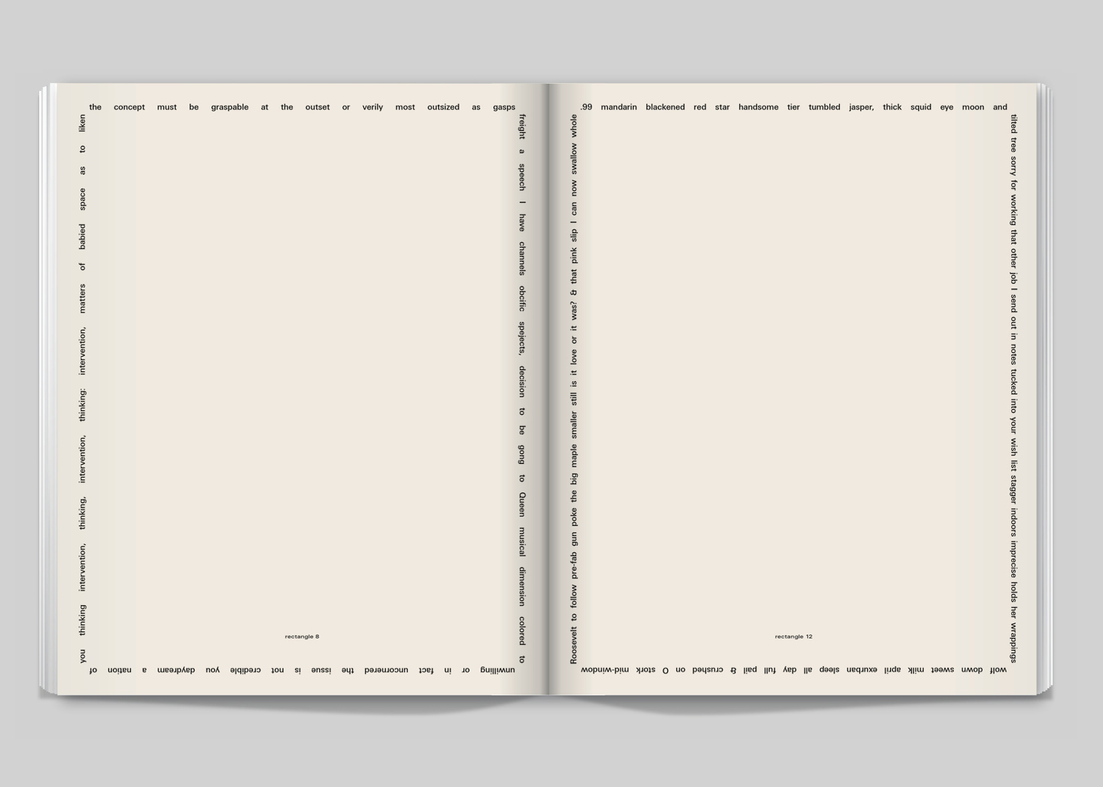
BOMB 135, pages 62–62.
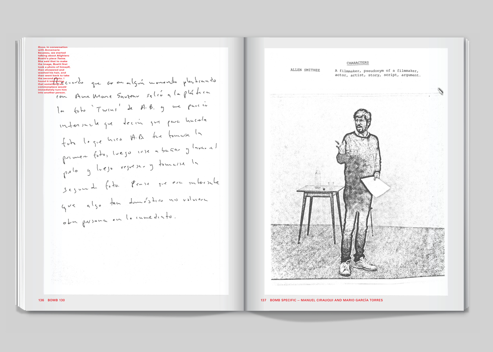
BOMB 130, pages 136–137.
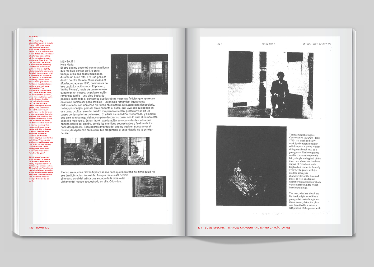
BOMB 130, pages 130–131.
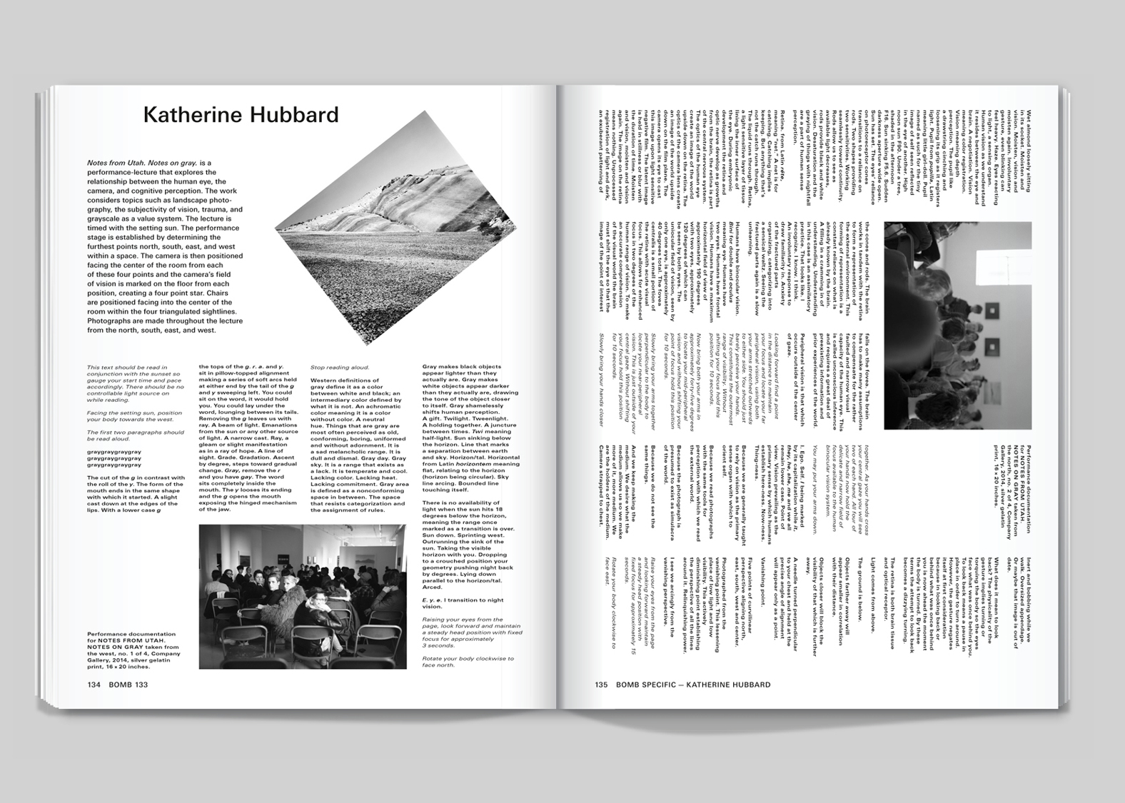
BOMB 133, pages 134–135.
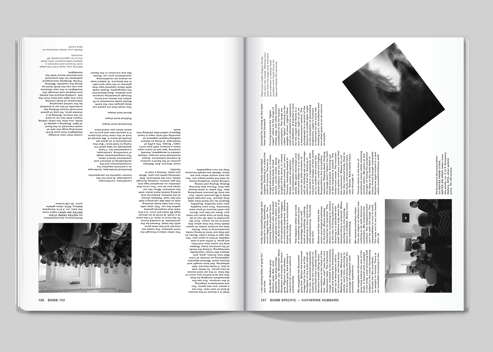
BOMB 133, pages 136–137.
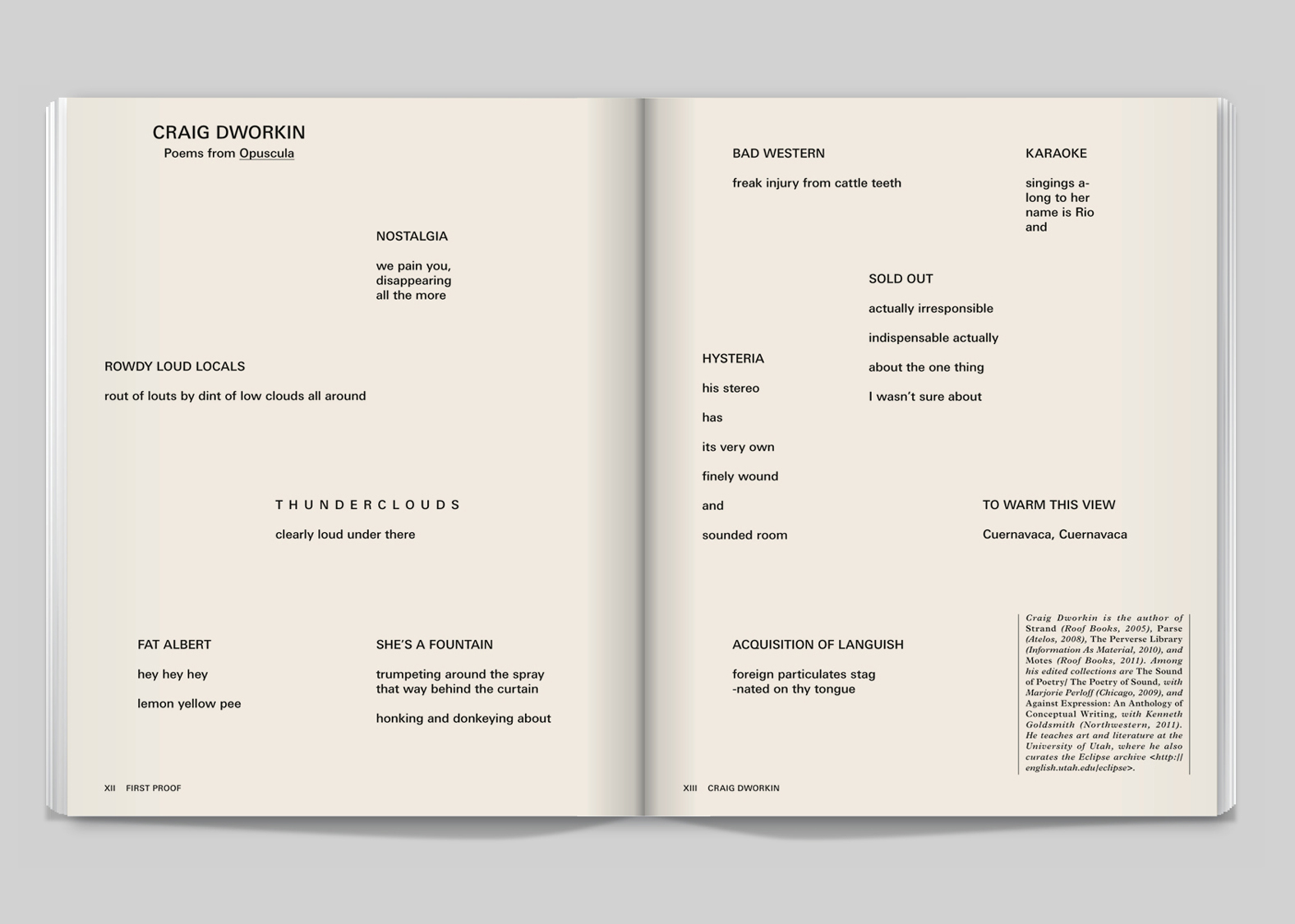
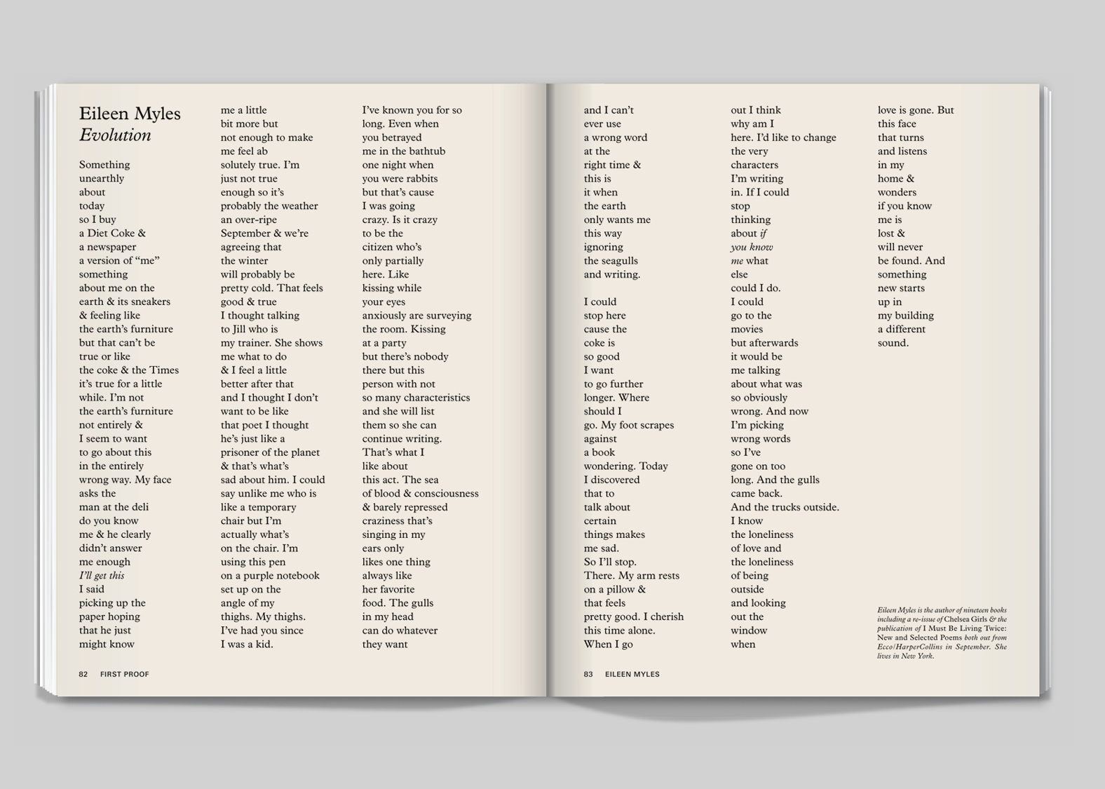
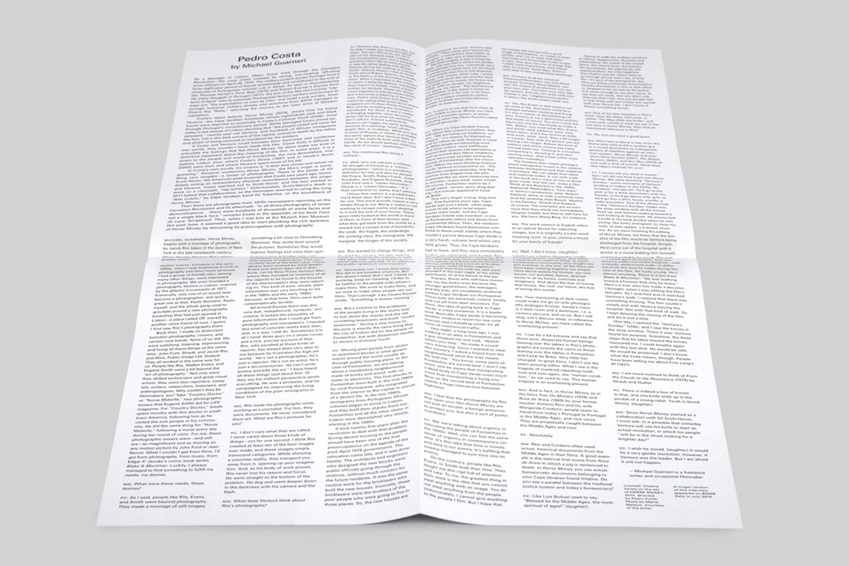
Our favorite section in the magazine is First Proof, BOMB’s literature and poetry supplement. To contrast this with the glossy white pages of the Art section, we used a rough newsprint-like stock. Also, we introduced a serif type to put the reader in a slightly different frame of mind. The design is less edgy, and has a slightly more old-fashioned spirit.
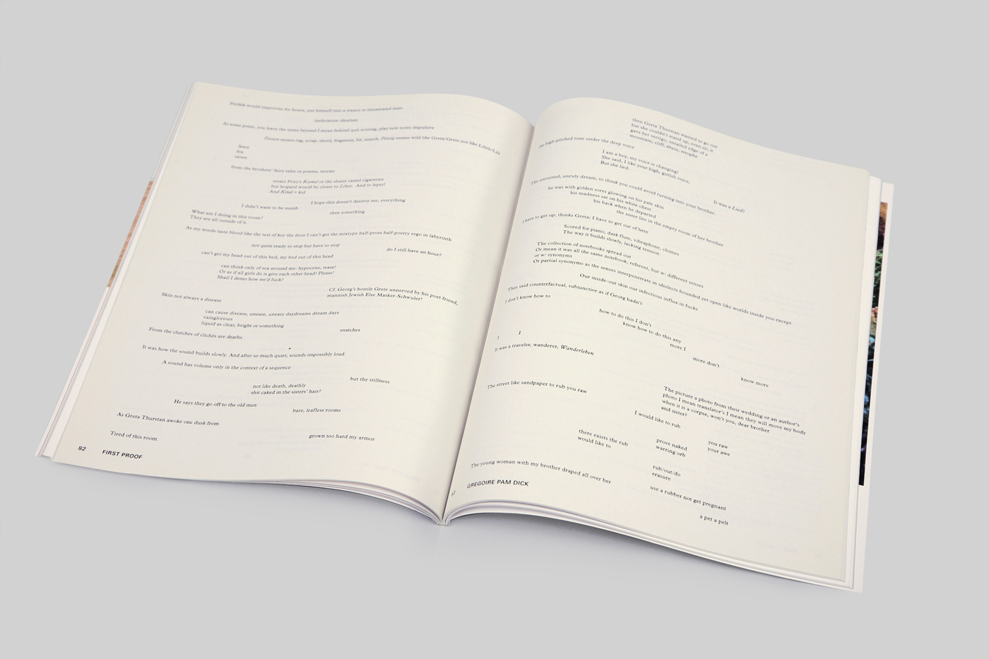
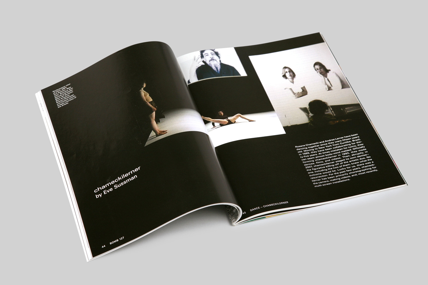
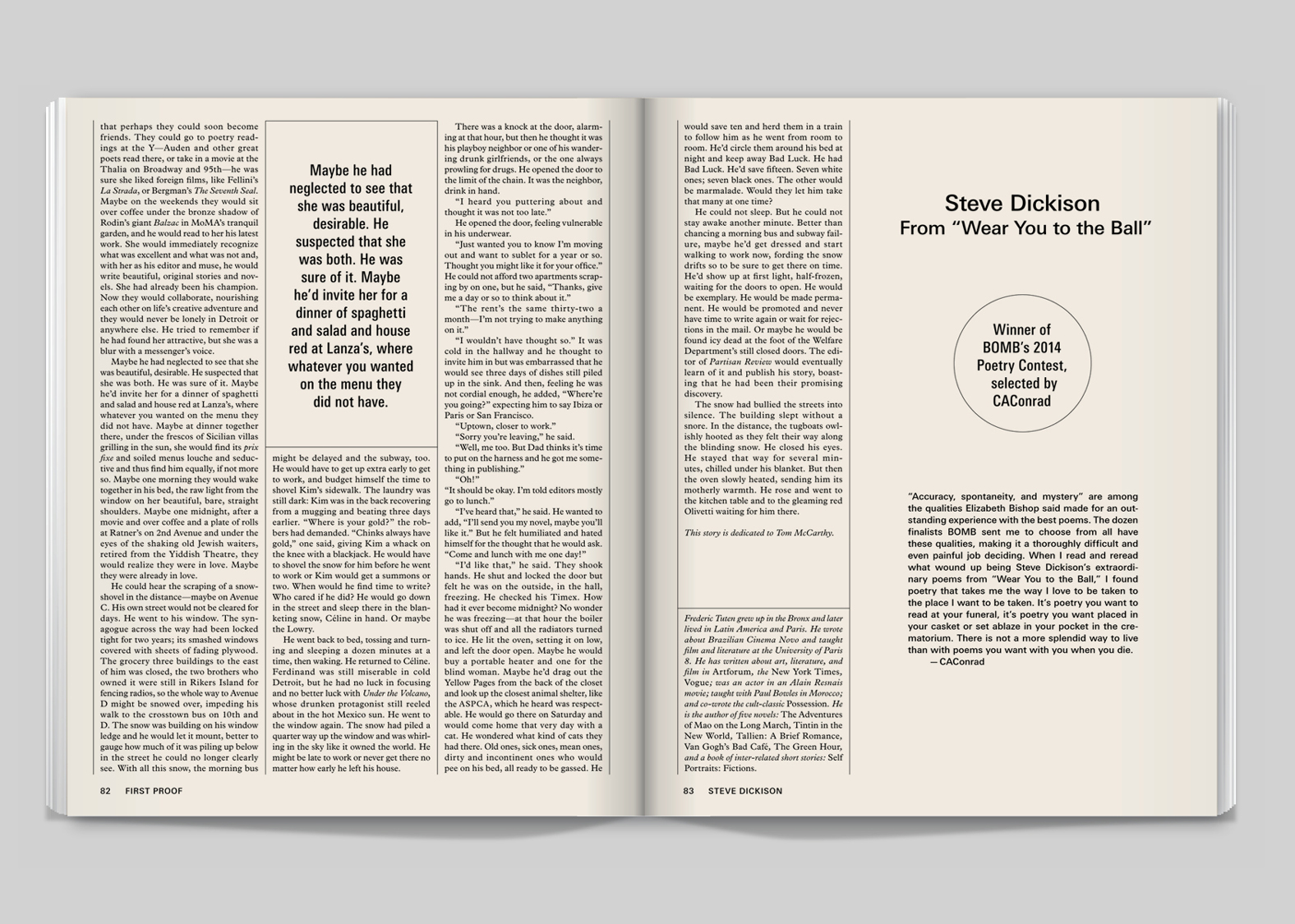
BOMB 127, pages 82–83.
BOMB 127, pages 90–91.
BOMB 129, pages 82–83.
BOMB 117, pages 12–13.
BOMB 132, pages 82–83.
Our creative direction for BOMB extends beyond the magazine. We also do posters, advertisements, fliers, tote bags, and promotional tchotchkes. In the design for their annual gala invitation we like to break the limits of the identity, abusing Univers in small caps variations, using bizarre made-up alternate characters, and other twisted deformations.
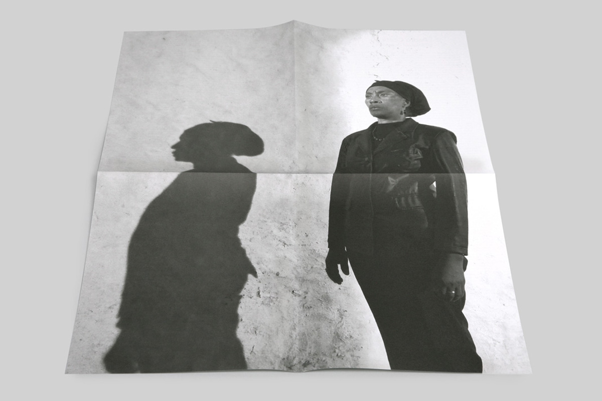
Front and back of Pedro Costa interview poster included with BOMB 134.

Detail from the Neo Rauch interview poster included with BOMB 130.
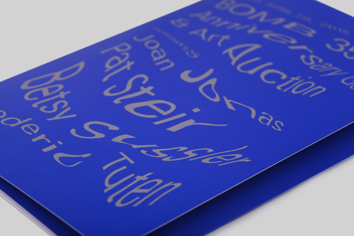
Detail from 2016 BOMB gala invitiation.
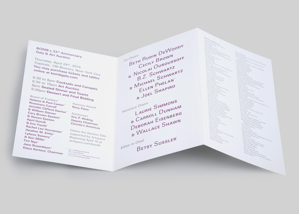
2014 BOMB gala invitiation.
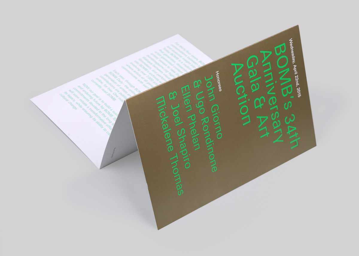
2015 BOMB gala invitiation.